
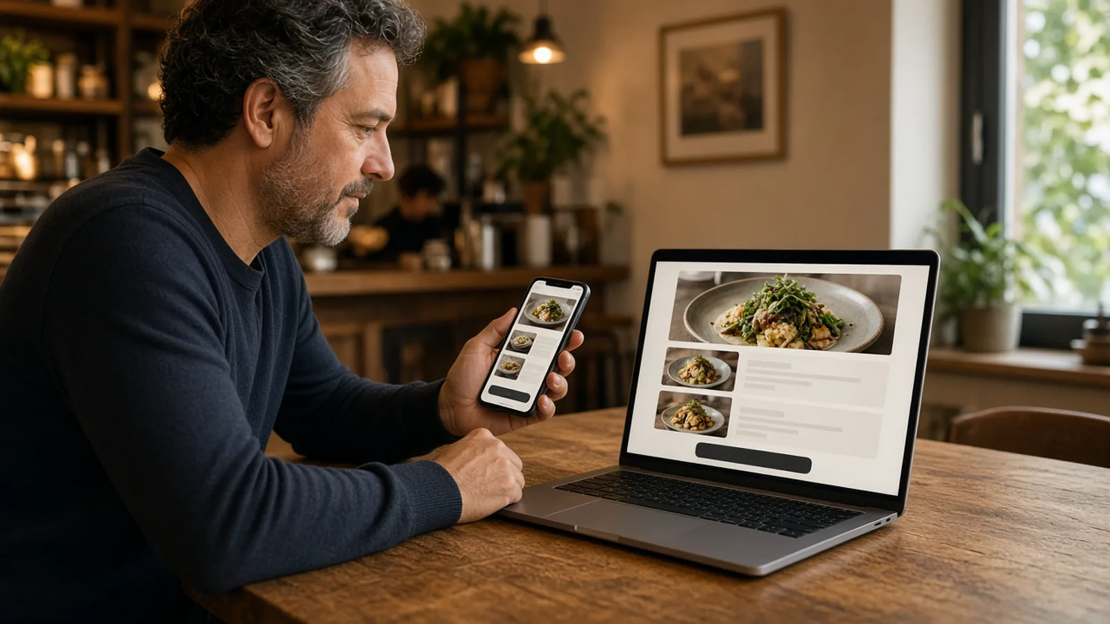
Restaurant website design is the path to the order
Owners who search for restaurant website design are usually staring at a page that looks finished and still does not sell dinner. A large hero, a paragraph about the family, and a button that downloads a PDF can win a compliment and lose the guest. Design here means the sequence: what they see first, how the menu is arranged, where the order button sits, and whether it arrives before they go back to the map.
How the site gets built is a different page. The wizard that scans a site you already have and launches ordering on your domain is restaurant website builder. The phone checklist is restaurant mobile website. Stay here for layout. If the page cannot take a modifier and a payment, no palette will save it.
Layout: one job above the fold
The first screen has one job. Show the food people already name, and show how to order it. Hours can sit in one line, because a closed kitchen should not look open. A story about the dining room can wait below the menu. Guests who want the story will scroll. Hungry guests will not hunt for the button.
Use one column. Three panels on a desktop become a mess on a phone. Put the usual plates first, then sides, then drinks. Do not sort alphabetically. The first item in a category should be the one most people came for. A popup, a reservation widget, or a marketplace badge in front of your button is a layout mistake. A call link can exist. It cannot cover the cart.
The phone is the real layout
Most of these pages are opened in one hand. Type has to be readable without zoom. Buttons have to fit a thumb. The cart has to stay findable while someone chooses modifiers. Add to cart belongs with the item, not in a corner they cannot reach. If you have to pinch to read a topping, the layout failed.
The storefront is mobile-first, so that stack is the default, not a later shrink. You still decide whether the first photo pushes the menu below the fold. A branded iOS app is on Growth and Growth Plus, after 3 months on Standard. Guests who will not install an app still need this page.
The menu has to look like something you can buy
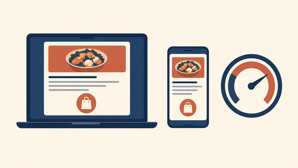
A menu in the design is not a photo of a printed card. Each item needs the name the kitchen uses, a price, and a short line for portion or heat. Photos belong on the plates that sell. Categories guests can scan beat one endless list. How many items deserve a button is small restaurant menu.
Modifiers are part of the layout. Size, temperature, and the topping that changes the plate need a control a thumb can hit, with the price on the choice that costs more. A notes box is for an allergy, not for building the dish. Structure and photos in more detail are online ordering menu. A limited plate you are selling only this week should lead, then come off. That offer is what is LTO food.
The ordering CTA is the design
Call the button what you say at the counter: order, menu, or pickup. Put it on the first screen, and again after the menu, so a guest who scrolled does not climb back. One label, one destination: your checkout on your domain. A button that opens DoorDash, Uber Eats, or Grubhub sends a regular to a checkout you do not own. Keep that logo off the first screen.
The cart should show a count and a subtotal while they browse. Hours should stop the order when you are closed, and say when you open. A dead button with no explanation feels like a broken design when the clock was the problem. Staff change the menu in restaurant admin. A price or a sold-out item should update the page the guest is looking at.
Speed is a design decision
A slow first view is a layout, even if you never drew it. Huge photos, an autoplaying film, and extra widgets load before the menu, and the guest feels that as closed. Compress the food photos. Do not upload a camera original. Skip the slideshow until the order path is boring.
Storefront pages are statically generated, with modern image delivery. That does not measure your photo. Test on cellular, outside the office wifi. If you sigh before the order button appears, fix the asset before you debate a typeface. Fewer steps are speed too. The first visit should be food, choice, and pay. The plate is the introduction.
A redesign is a later purchase
Standard is the ordering site: $249 per month plus 5% of net sales, or $499 per month with no commission. The layout above is that site. Growth, at $499 per month plus 7% of net sales, adds a main website redesign, a branded iOS app, and monthly work on 5 keywords, after 3 months on Standard. Growth Plus is $999 per month plus 10% of net sales and adds email, SMS, and 10 keywords. The redesign is the marketing site around the order. It is not required for the first ticket.
Do not redraw a homepage while the menu is still a PDF. Get the order path honest, place one paid test, and read the ticket. How it works is the setup. There is a 30-day free trial and no long-term contract.
How to judge a design this week
Open the page on a phone and count the taps to a paid test you would cook. Note what appears before the food. Put the usual plates first, give the order button one label, and replace any PDF link. Pay, print, and refund. If the ticket is right and the button was obvious, the design is doing the job.
Show it to someone who does not work the line. If they ask where to order, the button is decorative. Restaurants already on the platform are on the clients page. Questions go through contact. Compare a live menu in the live demo before you defend a mockup. Start 30 Day Free Trial. Call (888) 960-1359.